Dienstag, 28. Oktober 2008

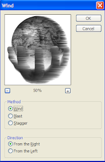
Wind Application in Photoshop

The wind application is very useful if u want to make something look as if it was in the wind. The way of applying this tool is very simple:
  • Open Photoshop
  • Choose Filter in the top menu
  • Press on Stylize
  • Then Wind
  • And then you have already got the menu seen below.
  • You can then choose if u want to make it look like wind, blast or stagger, and if u want it coming from the left or the right.You can also zoom in and out, depending on what exactly you want to see. This is the Wind tool…. Have fun!


Adidas Adi Pure


http://www.johnhenrysports.com/product/Adi_Pure_TRX_SG_AADIPU

The New Adi Pure is a great design. Although it may really look old school, it is a great boot. I, myself am wearing the boot, and I can say that I love it. For the past years I have changed my football boots very often, I wore several Nike models and the Adidas F50 last year. All of these shoes always lacked something. No matter if it was the personal touch I was missing in the Nike vapors, or the quality in the studs of the Adidas F50. The new Adi Pure on the other hand, is very close to perfection. It is extremely comfortable, light weight, and is very close to the ground. The technology behind this shoe isn’t old at all; it is as modern as it can be. It fits the highest expectation which is proven by the fact that many top stars such as Frank Lampard and Philip Lahm wear this boot. Something that is even more astonishing than the shoe itself is the price. It only costs 100 euro. This may sound like a lot, but the other boots in this quality cost between 190 and 250 euro. Overall, this is a greatly designed shoe which may look old school, but has very modern technology, for a very good price.


The New MacBook

http://gizmodo.com/5063492/macbook-and-macbook-pro-dual-review

The New MacBook is a really good, but not great design. The new versions are made of a complete aluminum case which makes them lighter, and like always, look really good. In addition a new mouse pad has been created and installed; this works as an interactive panel. The same panel can be used for the click, moving around the mouse, or using one of the new applications of twisting, and turning pictures; as well as zooming in and out. Overall, the MacBook doesn’t really offer anything really new besides the mouse pad, but the people will still go to the stores and buy the product. They just love the design, and want to have the newest and best which Mac has to offer. Mac really has to be complimented on this, they create objects which we feel as a "must have". They should keep up the good work, and maybe come up with some new inventions which are really significant for the next time.


Dienstag, 30. September 2008

Weekly Design Post


http://www.toysgadget.com/calls-only-eclipse-design-phone-is-a-dudly-disaster/technology

This is the so called eclipse design phone. It only has a number panel, and a screen to see what you are typing. It includes nothing which the, also modern phones, such as the iphone have. It doesn't have a camera, games, or any multimedia device options. It is just a plain phone, no features, nothing. I personally think that the phone looks great, and the idea behind it isn't bad, but just not as good. I think a lot of people need more than only a phone in the modern time. We will see how good it is when its going to get produced.

Font Pictures


helvetica movie notes

Movie Notes - Helvetica

Helvetica used in:
• Brand names (American Airlines, IBM, Met life, greyhound, deBijenkorf, Sears, Jeep, BMW, Toyota, McLare, Aprilia, Kawasaki, Target, Tupperware, Nestle, verizon, conEdison, Lufthansa, Muko, Energizer,Saad, Oral-B, The North Face, Fendi, Staples, Fifa, Adidas etc.) loads of car brands, because it is clean
• Informative signs
• Street signs
• Logos

It is:
• Simple
• Neutral
• Easy on the eye
• It is sans serif, has no serif
• Letters have uniformity
• Perfect spacing
Modernist font – represents modern ideas of space, movement, timing, relaxed, but it is sans serif and easy on the eye.
Bad because Ubiquities (everywhere)
• It is everywhere
• Boring
• Too simple
• Perfect
Represents government identities (because it makes you feel safe)
Corporal
Means it is institutional
Its modern in and out. Retro modern

Creating a Font

  • first design the h.
  • It has a straight line and the semi-circle, then the o and p are very simple to do. When those are there, you have n, u, p, d, b,
  • Continue writing words which create the rest of the letters
  • who structure is based on the horizontal slicing of of terminals.
  • Nothing cut of at an angle, only complete horizontal
  • designer cant improve helvetica.
Other than being authoria, beaurocratic, and epressiam, using helvetica they seem, excesable, transparent, and accountable.

Font gives a corportion a tone... fancy font, fancy company, excesable font, makes it excesable company.

Real typeface = needs rythm and contrast... helvetica has neither

Arial is a copy of Helvetia

Helvetica:
needs lots of space around it
tired to make every letter look the same which is very bad.

Typeface is part of branding, branding is projecting quality

Counter culture movement 1940-1960 act of rebellion who were the founders modernists ; rise of the flower power movement, cutting edge (cutting into the skin), this combined brings the counter culture movement

as a result people wrote back by hand to show that this is better than helvetica.

What you write should speak to the writer and he should be able to understand it. On the other hand, putting something crap into the a illegible font, makes it at least look interesting. When you have a great but too short article make it a hard to read font so the people have to read it very often.

Modernism and post modernism was the difference between objective and subjective.

modernism:
  • functionalism
  • utilitavianism
  • objectivist
  • more simple
  • clean
Post-Modernism:
  • subjectivist (100 different fonts for everything you do. It should match the text)
  • more free form
  • more chaotic
  • complicated
Key to modernism:
  • objectivism
  • subversive - something running against the norm
  • clean

Grunge period: late 90's.

Mittwoch, 24. September 2008

Categories of type

6 main categories of fonts:
Oldstyle -
  • thick/thin transitions.
  • thinest point of every letter is diagonal.
  • Diagonal Stress.
Modern -
  • tend to have a cold, elegant look.
  • Strong thick/thin transitions.
  • the thinnest point is horizontal.
  • Has a vertical stress.
  • Should not be used for long texts
Slab serif -
  • Vertical stress
  • little or no thick/thin transition
  • Easily be used in extensive texts.
Sans serif -
  • Without serif
  • No thick/thin transitions at all
  • So stress because there is no thick/thin transition.
Script -
  • Look like they have been done with a calligraphy pen or brush.
  • Should only be used sparingly because else we get sick of them.
Decorative -
  • Look interesting.
  • Express anything you want without limits.